Today we’re going to talk about landing page optimization best practices. Why? Because it’s one of the most important steps in your lead generation strategy.
There are a ton of posts and guides out there that talk about how to best optimize your landing page. However, in our research, we have found that they were either overwhelming or boring. So we’ve decided to create a landing page optimization guide that’s not only easy to digest but entertaining as well.
Do either of these scenarios sound like you?
- Scenario 1: You’ve created a landing page, started to promote it, and traffic is coming in, but the leads just aren’t adding up. Is the copy failing to connect with your visitors? Is the design impacting the user experience? What is going on
- Scenario 2: Your landing page has been up and running for a while now. In the beginning, it was doing so well that you decided to “set it and forget it.” As the saying goes, “if it ain’t broke then why fix?” Then all of a sudden, your leads grow cold, and you’re not sure why.
So what’s the issue? You likely have an optimization problem.
Now, before we dive into landing page design and optimization, let’s first go back to the basics and discuss what a landing page is.
What is a Landing Page?
Let's get this out of the way. Your homepage is not a landing page. Neither are your contact us or about us pages. I repeat, a landing page is not a homepage. Nor is it a “Contact Us,” or “About Us” page. Please, let this sink all the way in and don’t ever forget it.
| A landing page is a standalone page that allows you to capture a user’s contact information via a lead form. |
Unlike your homepage, landing pages are campaign-based lead generation tools. They are targeted to a specific stream of traffic and have one single purpose, which in turn allows you to convert a higher percentage of web users into qualified leads.
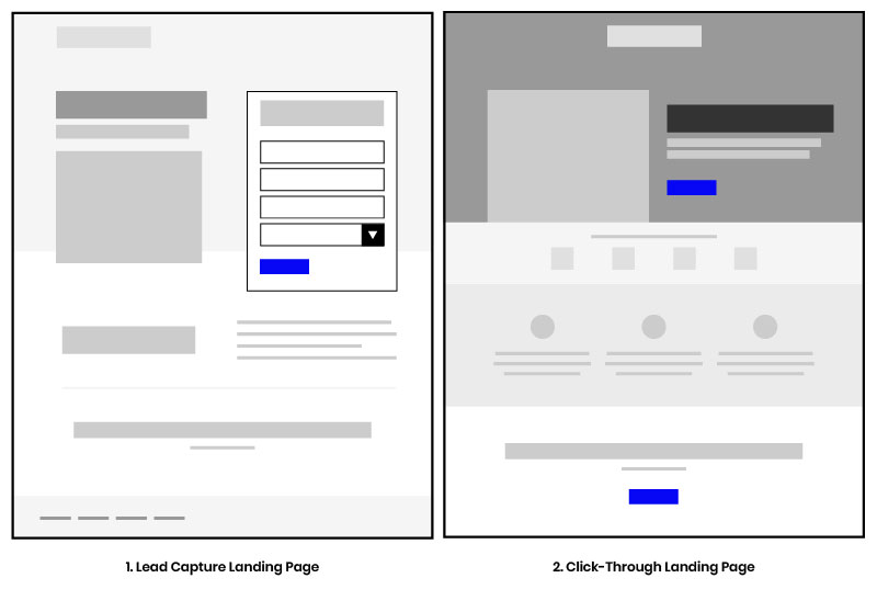
The two main types of landing pages that guarantee conversions:
- Lead capture (or generation): The most common landing page, lead capture pages are used to capture a users contact information, generally a name and email address. These pages contain a form for you to submit your details in exchange for some sort offer, i.e., eBook, but do not have an exit path, i.e. link to navigate to other areas in your website, This type of landing page is perfect for building your email list.
- Click-through: The simplest of landing pages, click-through pages provide details about a product, service or offer and its benefits in such a way as to convince a prospect to purchase. With this landing page, all a user can do is read through the content and click-through, via a CTA, to your website to complete the transaction.
The sole purpose of a landing page is to convert your website visitors into leads on a single offer. To accomplish this you must turn to your target audience. You need to know your ideal buyers inside and out so you can cater to them. This way you can design a landing page that speaks directly to them and where they are in their shopping journey.
When to Use a Landing Page
There are several reasons to use a landing page:
- When you want to send users to a relevant targeted page, that’s personalized for them.
- To provide a consistent experience from ad to landing page.
- To promote your free eBook or guide.
- To encourage users to subscribe to your newsletter.
- To promote your event (here’s an example).
- To promote the launch of a new product or service.
No matter what you’re offering or what you’re using your landing pages for, there are several ways your ideal buyers can and will land on them:
- A Google ad (PPC)
- Social media ads
- CTAs on your main website or blog
- A link in an email
- Search engine results
To make your conversion process successful once a user lands on your landing page, you must have a well-optimized landing page.
Why Is My Landing Page Not Converting Leads?
Landing pages fail to convert leads for various reasons, the main culprit is failing to understand your buyer persona or target buyers. If you aren't writing your landing pages based on what your buyers want and who they are, guess what? You’ll be lucky to generate any leads.
The most common mistakes we’ve seen with landing pages are:
- Terrible design
- Poor headlines
- Inconsistent calls-to-action
- Asking for too much information
- Too many distractions and too much friction
- Failing to clearly explain the offer
- Your visitors don't trust you
We'll discuss how to remedy these common issues below to boost your landing page conversion rate.
What’s a Good Average Landing Page Conversion Rate?
Now, you may be wondering, what’s a good conversion rate?
According to WordStream, the average conversion rate across all industries is around 2.35%. However, the top 25% of landing pages are converting around 5.31% or higher, while the top 10% are converting at an astonishing 11%!
Now, don’t pull your hair out our stress over these numbers. Conversion rates are subjective. What may be a good rate for one business, may not be the same for another.
However, what you can do is set your own marketing goals and work on improving your current conversion rate by following landing page optimization practices.
What is Meant By Landing Page Optimization?
Landing page optimization is the process of removing or adding elements on a website to increase conversions. A subset of CRO (conversion rate optimization), this process also involves A/B testing which allows you to better gauge which elements do or don’t work (connect with your target market).
You see, landing pages are designed to help you generate quality leads. Improving their performance through optimization ensures that you receive a significant conversion rate from visitors. This ultimately improves your online marketing results.
So, what's the deal with the orange paper? I'm not very fond of my face being in front of a camera.
11 Landing Page Optimization Best Practices to Improve Your Conversions
Optimizing your landing page is all about the user experience.
When designing your landing page for lead generation and conversions, there are some guidelines you should adhere to achieve optimal success. Below, we break them down by section as we highlight the best practices for designing and optimizing any landing page.
1. Keep your layouts simple and embrace white space
Simple and minimal always win. Gone are the days of cluttered landing pages. Keep your layout clean, elements to a minimal, and copy straight to the point. Stick to one concept and allow your users to focus on your call-to-action.
The goal is to not overwhelm your potential customers. You overwhelm them and they're sure to bounce at a high rate.
2. Make sure all important information above-the-fold
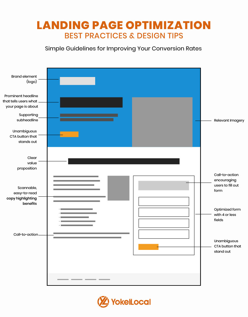
When we say about important information, we're referring to the must-have landing page elements that will convince your potential customers to convert. They are:
- a clear headline
- a value proposition (usually located under the headline)
- a clear CTA
- an optimized form
3. Develop relevant copy that connects with your target buyers
Your landing page isn’t the time for guessing games. Make your offer as clear as day.
Your visitors should know exactly what it is they’re getting in exchange for their contact information. Not only that, but you want to use copy that makes your target audience feel good like they will accomplish something with your offer.
4. Make your calls-to-actions clear and unambiguous
You can’t capture leads without call to action buttons, the most important element on your landing page. How else are your visitors going to convert if they have nowhere to click?
There should only be one CTA used across your landing page that aligns with your offer. (Don’t include any extraneous offers that can draw the user to do something else.) Don't get all jazzy and cute with the button text. Clearly state want you want users to do. If you’re offering a free guide, you CTA should say “Download the Guide."
Secondly, don’t bait and switch. Don’t collect someone’s information without giving them the promised offer on the next screen.
Lastly, give your CTA room to breathe aka let your CTA shine and stand alone. It should boldly stand out from all other elements on your landing page.
5. Capture leads with an optimized form
Did you know the average number of fields on a landing page form is 11 (PageWiz)? Now, don’t let this mislead you. Research has found that less is more when it comes to forms; reducing your form fields from 11 to 4 can increase conversions by 120%. Though this is a general rule of thumb, when developing forms for your landing pages consider the following:
- Where the buyer is in their shopping journey. Landing pages targeting users at the top of the funnel will typically have few form fields than those targeting users at the bottom of the funnel.
- How your forms will look on mobile devices. Most users will be using mobile device. Make sure your form (and landing page) is mobile-responsive.
- Ask for information you must have based on the value of your offer. For example, if your offer is a top-of-the-funnel eBook you need to ask for nothing more than a name and email address. However, if your offer is a free consultation you require more information from leads such as a phone number, company name, and job title.
6. Use contrasting colors
This best practice primarily applies to your call-to-action buttons. Now, it’s not necessarily the color of your CTA that matters, but rather the contrast. Your landing page CTA buttons need to stick like a sore thumb.
While we’re on the topic of color, it is highly recommended that you maintain consistency in the use of your brand colors. Whatever colors are used on your main website, should be applied to your landing pages (typography as well). Do not treat your landing pages as if they’re on a separate website.
7. Visual media (images and videos) is your friend
Images on your landing page should showcase your offer or product, introduce your team members and form a human connection, or create an emotional connection with the visitor. This media can be the hero image in your header or a reasonably sized image located to the left or right of your form.
Videos on the other hand can be used to increase the engagement on a page, and show show how easy it is to use your product or service. According to EyeView, a relevant embedded video can increase your conversions by 86%.
8. Develop trust with social proof
People buy from brands that they trust.
Whether it’s a list of clients you've worked with or actual testimonials, you want to show that you’re a legitimate business by adding this information to your landing pages.
Take it step further and add your phone number, which we highly-recommend, or include a snippet of a case study.
9. Pay attention to landing page SEO
SEO doesn’t really matter for landing pages used for short-term campaigns. However, if you’re landing pages are for longer projects, they need to be search engine optimized like any other page on your website.
So just how do you SEO a landing page? It’s simple:
- Use keywords in your title, meta description, and URL.
- Use keywords and semantics in your landing page content. You need to let Google and other search engines know exactly what your page is about.
10. Reduce page loading time
Due to most people using their mobile devices to browse the internet, page speed now plays a key factor in user experience. If you landing pages are slow to load, you’re pretty much guaranteed to have a high bounce rate and few conversions. The faster your page loads the better.
Don't know how to reduce your page loading time? Turn to your developer.
11. Get in the habit of A/B testing
Take your LPO further with A/B testing your landing pages, but be smart about it. As traffic to your landing page increases, test certain elements to see which helps boost your conversion rates. Use heat maps to get a better insights into how users are interaction with your page. Please be aware, you can’t and should not split test any elements on your landing page until you have a good amount of data. Running A/B tests without data is a recipe for failure.
| Pro Tip: Use Google Analytics to measure the effectiveness of your landing pages. Learn more on how to use data to measure your digital marketing efforts and achieve marketing success. |
Wrapping It All Up
After reading these best practices, use them to improve your landing page(s) so you can start getting more leads and sales.
By the time you finish your LPO, it should be one of the best pages on your website.
Before you go, download our free guide that helps you identify and eliminate your website's conversion killers.


